
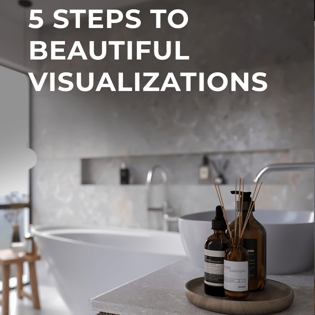
Are you struggling to make your renders look realistic and professional? In this article, I’ll walk you through 5 essential rules that will help you create photorealistic visualizations.
These tips come from my own experience as an architect and visualization instructor, and I promise—they’ll save you time and frustration while improving your results.
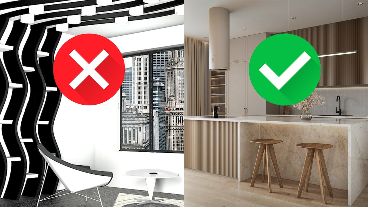
1. Start with a Clean and Well-Organized 3D Modelts for D5 Render
Many rendering problems actually begin with the model.
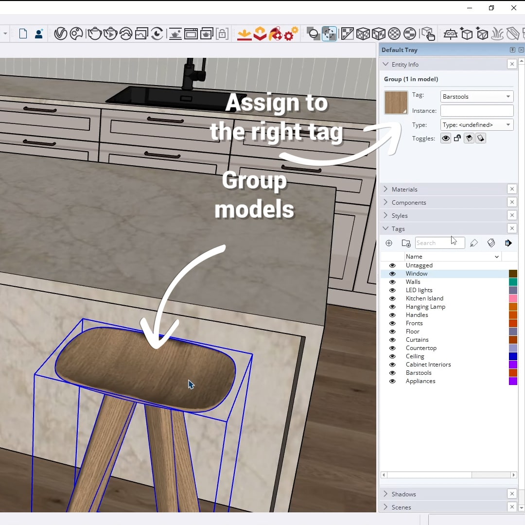
- Make sure all elements are properly grouped and assigned to the correct tags.
- Avoid messy or overly complex geometry.
Pro tip: When downloading models from the internet, always open them in a separate file first.
Clean them up, fix any geometry issues, group everything properly, and make the model lighter before importing it into your main project.
2. Scene Composition
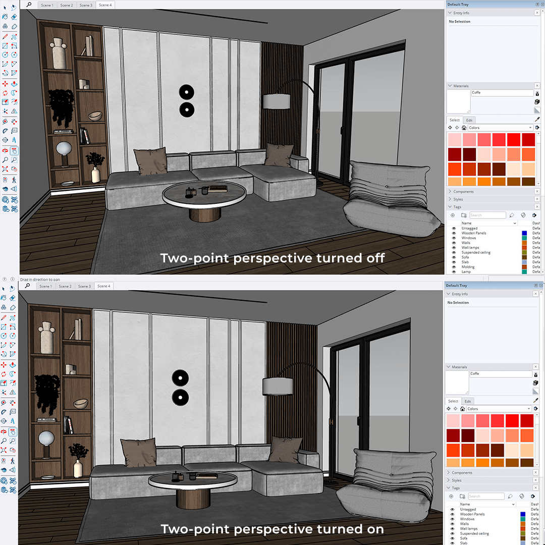
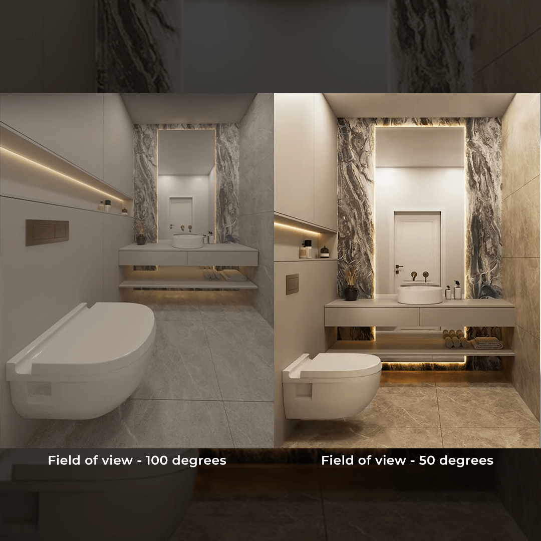
Choosing the right camera angle is crucial. A good angle makes your scene look amazing, while a poor one can ruin the whole image.
- Set your field of view between 40° and 60° (I recommend around 50°).
- Always turn on two-point perspective to keep vertical lines straight. This helps your render look clean and professional.
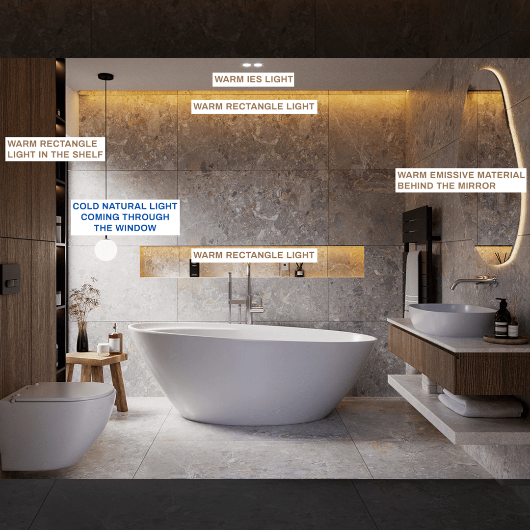
3. Lighting – The Key to Realism
Lighting can make or break your render. Start with natural light using HDRI maps—they provide realistic lighting and background environments. Great sources for free HDRIs include PolyHaven and AmbientCG.
Mix natural and artificial light for the best results. Use IES or Spotlights for focused lighting
and Rectangle Lights for LED strips.
A warm tone (3000–4000K) for artificial light works beautifully with cooler natural daylight.
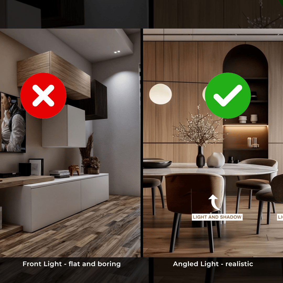
Always aim for a good balance of light and shadow, and avoid front lighting. Lighting from the side or at an angle adds depth and realism.
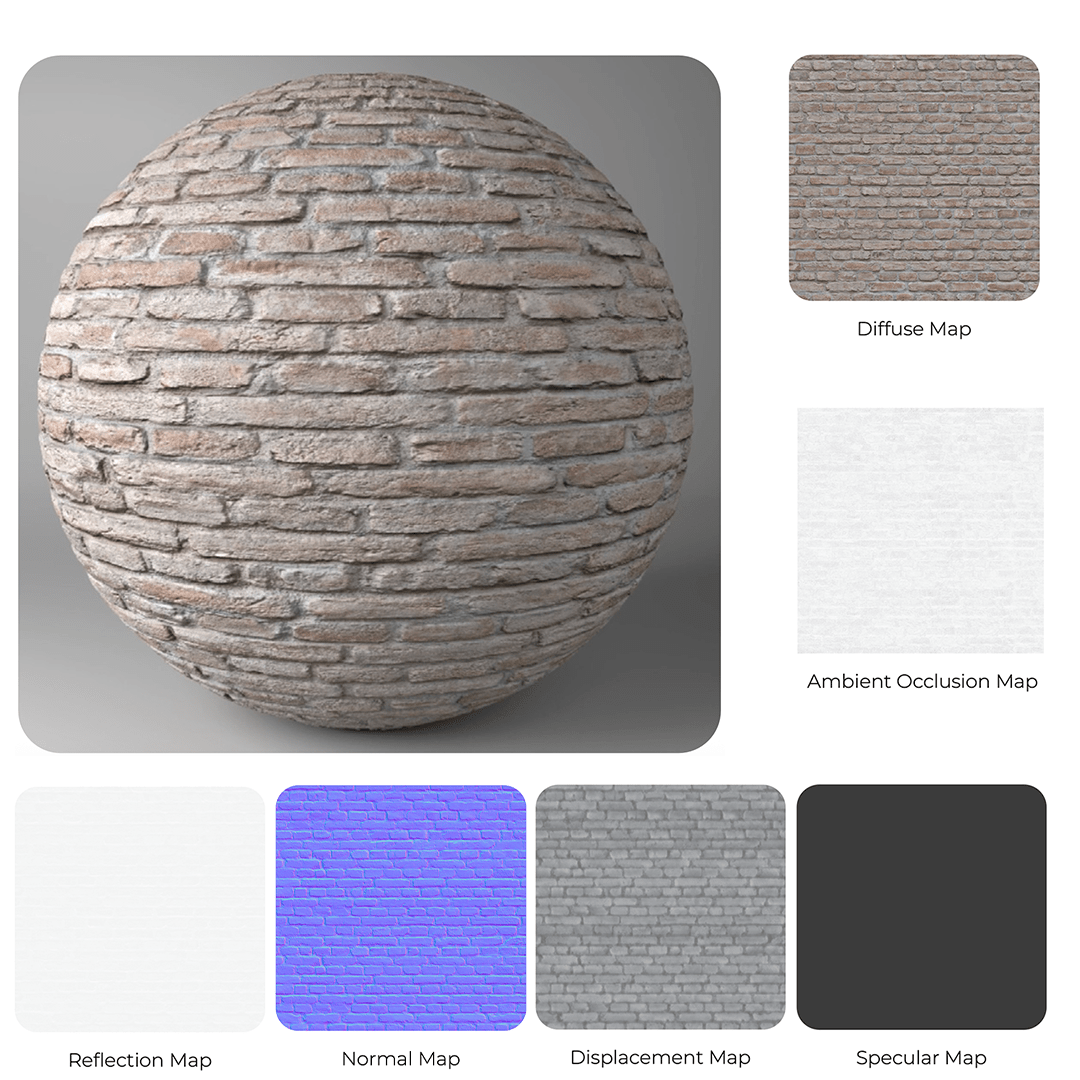
4. Use High-Quality Materials
Photorealism requires more than just a base color. Use these texture maps:
- Diffuse (Albedo): The base color
- Ambient Occlusion: Soft shadows blended with the diffuse map
- Glossiness/Roughness: Surface reflection properties
- Normal or Bump: Surface detail without geometry changes
- Displacement: Real geometry depth (perfect for bricks, stone, etc.)
Use high-quality PBR materials from AmbientCG or Textures.com. I usually go with 2K resolution. You can use 4K or 8K for more detail, but keep in mind that higher resolutions can slow down your project.
Don’t forget about built-in material libraries in your render engine—they’re a huge time-saver.
5. Final Touches: Details and Post-Production
Accessories like plants, pillows, and dishes fill the space and bring it to life—but only if they’re high-quality. Avoid flat textures and poor geometry.
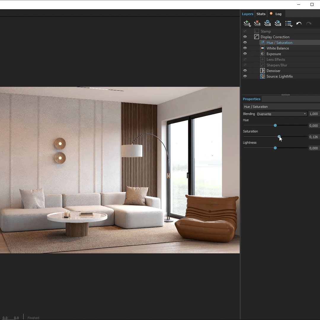
Modern render engines like V-Ray or D5 come with built-in post-production tools. You don’t need Photoshop! Here’s what I usually adjust:
- Exposure – for brightness
- Contrast – for depth
- White Balance – for tone
- Saturation – for vibrant colors
These might seem like small improvements, but they can take your render from good to great.
Download the Free eBook
If you liked this guide, be sure to download my free eBook where you’ll find all the key rules and examples to help you create better renders. The download link is HERE
Thanks for reading, and happy rendering!