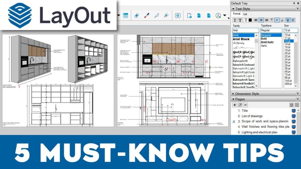
SketchUp Layout, part of SketchUp Pro, allows you to convert your 3D models into detailed 2D drawings effortlessly. With Layout, you can create professional construction documents, architectural plans, and technical drawings with ease and precision.
Let’s discuss 5 tips for better documentation in SketchUp Layout to optimize your workflow and enhance the quality of your work.
1. Speed Up Your SketchUp Layout
Experiencing slow performance in SketchUp Layout can be frustrating, but there are several ways to optimize and speed up your workflow. Here are some practical tips:
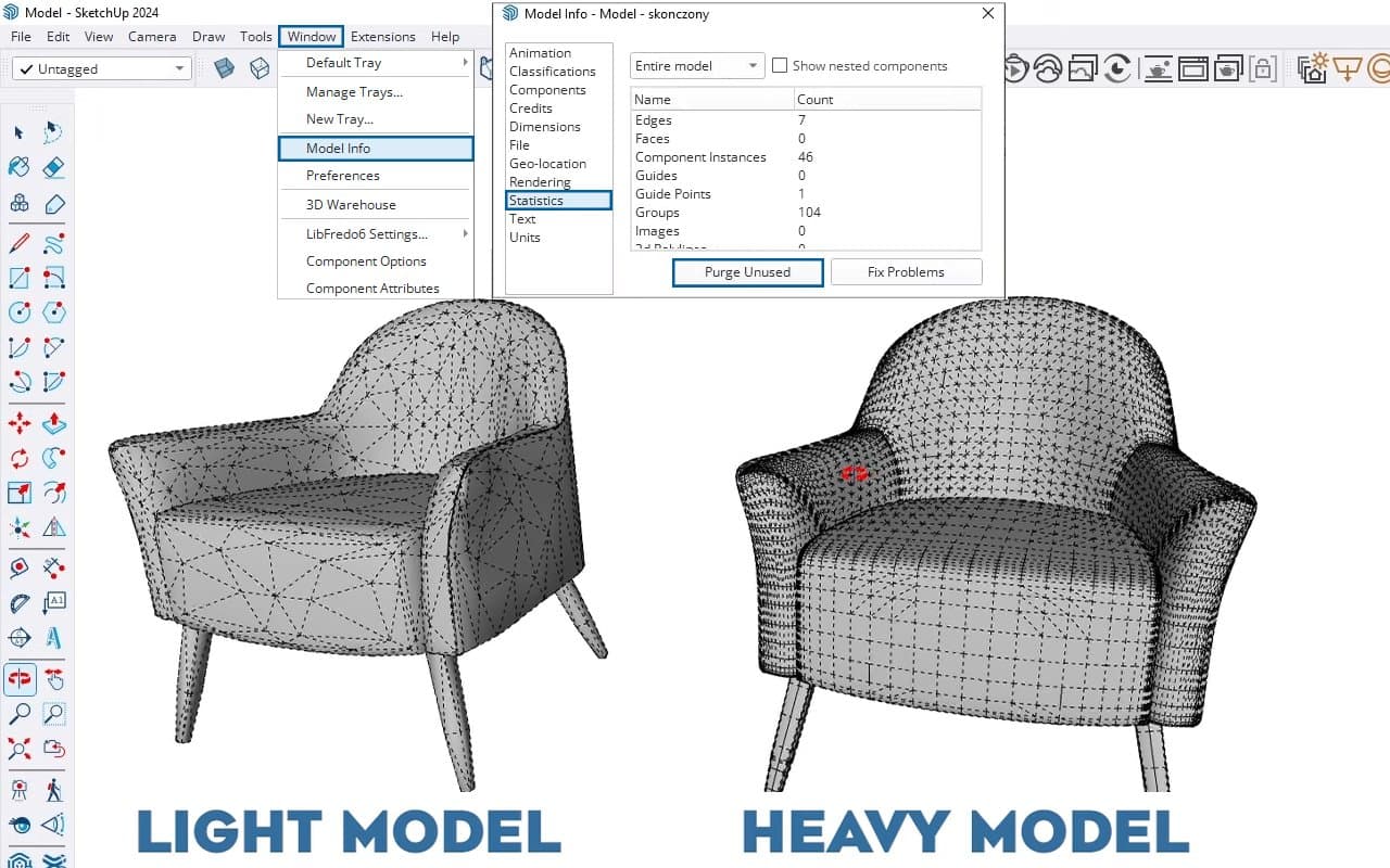
- Simplify Your Model: Heavy SketchUp models lead to slow SketchUp Layout performance. Reduce geometry and purge unused components and materials.
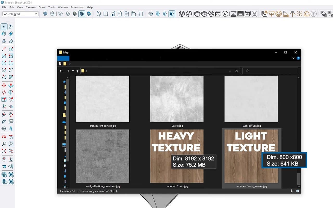
- Lower-Resolution Textures: If you’re not creating high-quality visualizations, use lower-resolution textures. I recommend using textures with a resolution of around 800 – 1000 pixels.
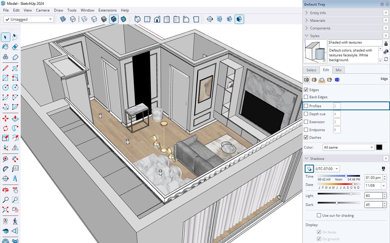
- Turn Off Shadows and Profiles: These features can slow down performance. Turn them off for a faster experience. You can find the Profiles option in the Style window and the Shadows option in the Shadows window in SketchUp.
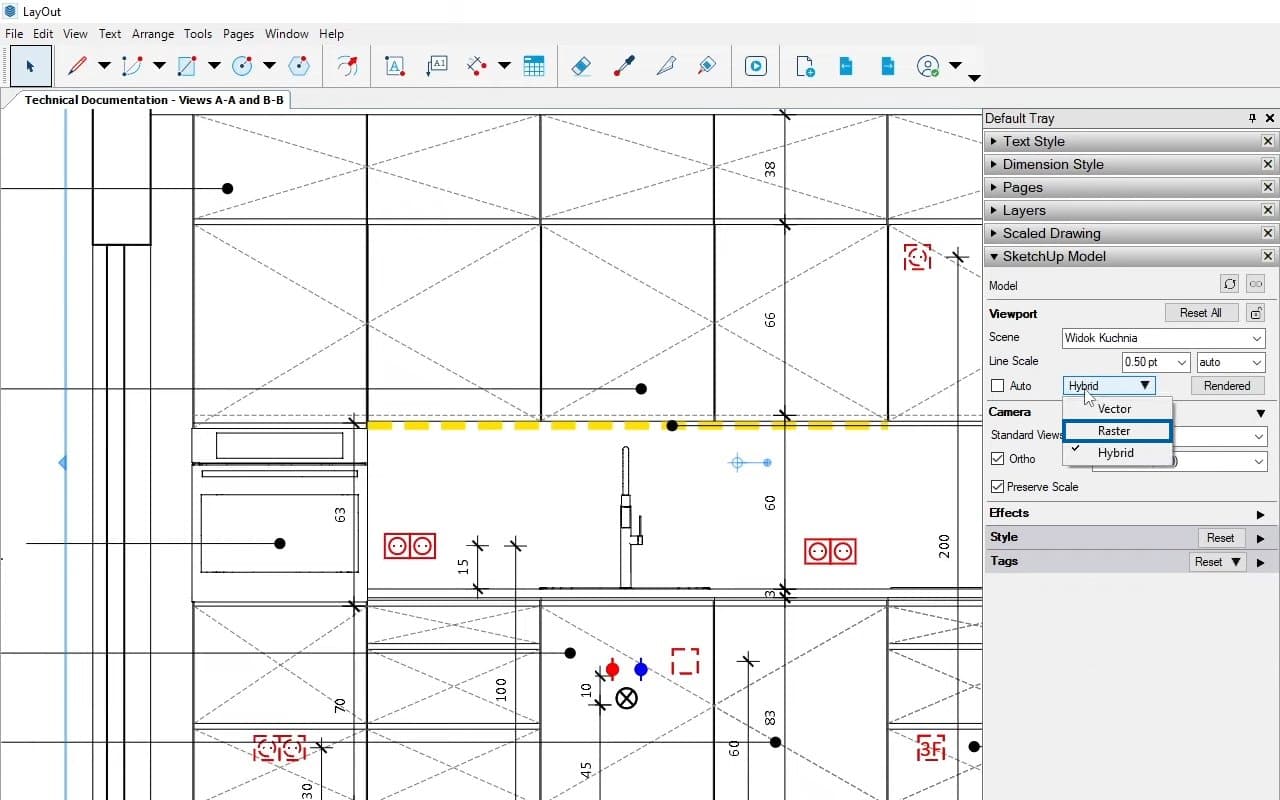
- Use Raster Rendering in SketchUp Layout: While raster rendering reduces the quality of your drawings, it significantly speeds up SketchUp Layout. You can switch to hybrid rendering before exporting for better quality.
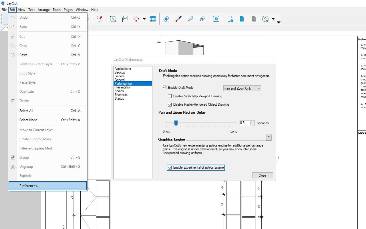
- Experimental Graphic Engine: If you’re using SketchUp 2024, try the Experimental Graphic Engine in Layout Preferences. It’s still under development, so if you encounter issues, simply uncheck this option.
2. High-Quality SketchUp Model = Precise Documentation in SketchUp Layout
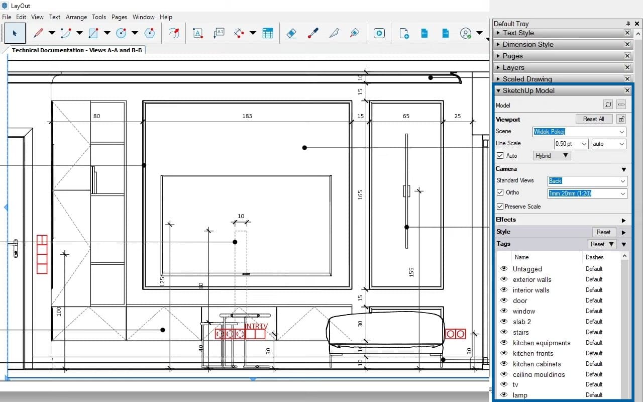
Technical documentation in SketchUp Layout is based on the 3D model created in SketchUp. If your 3D model is well-organized with tags, groups, and components, and you have full control over it, you’re on track to create precise and clear 2D documentation.
For interior projects, I prefer to use more than 10 tags, such as Walls, Floor, Lighting, Accessories, and various types of furniture. I strive for accuracy, so I create separate tags for cabinets and cabinet fronts. This approach helps me produce detailed documentation for custom furniture.
Remember, in SketchUp Layout, all tags from SketchUp are carried over. You have complete control over which tags are visible or hidden on each drawing. Simply select the drawing in SketchUp Layout and use the options on the right side to toggle specific tags on or off.
3. Layers in SketchUp Layout
Tags in SketchUp are as crucial as Layers in SketchUp Layout. Issues with hidden dimensions or annotations often arise from improper layer arrangement.
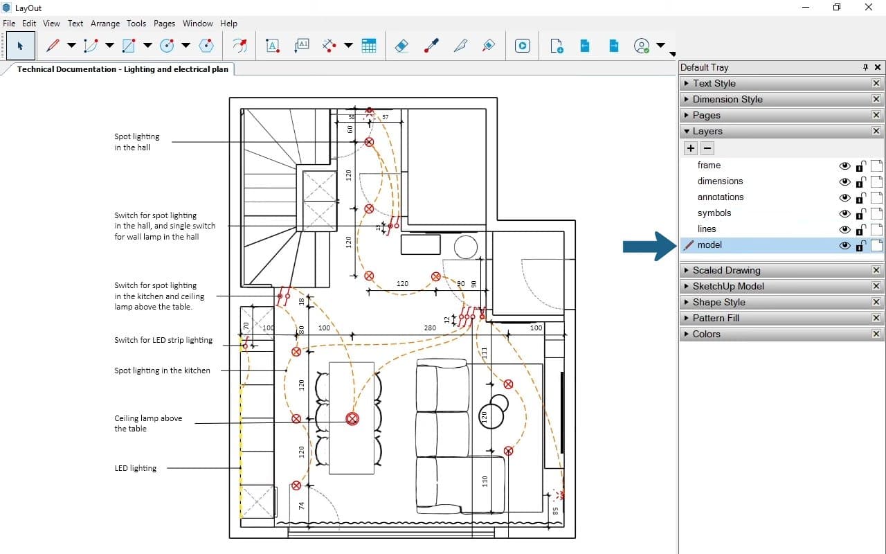
On the right side of SketchUp Layout, you’ll find the Layers panel. I’ve created few layers for different elements such as the Model, Dimensions, Annotations, and Extra Lines or Symbols. I assign each drawing element to its respective layer.
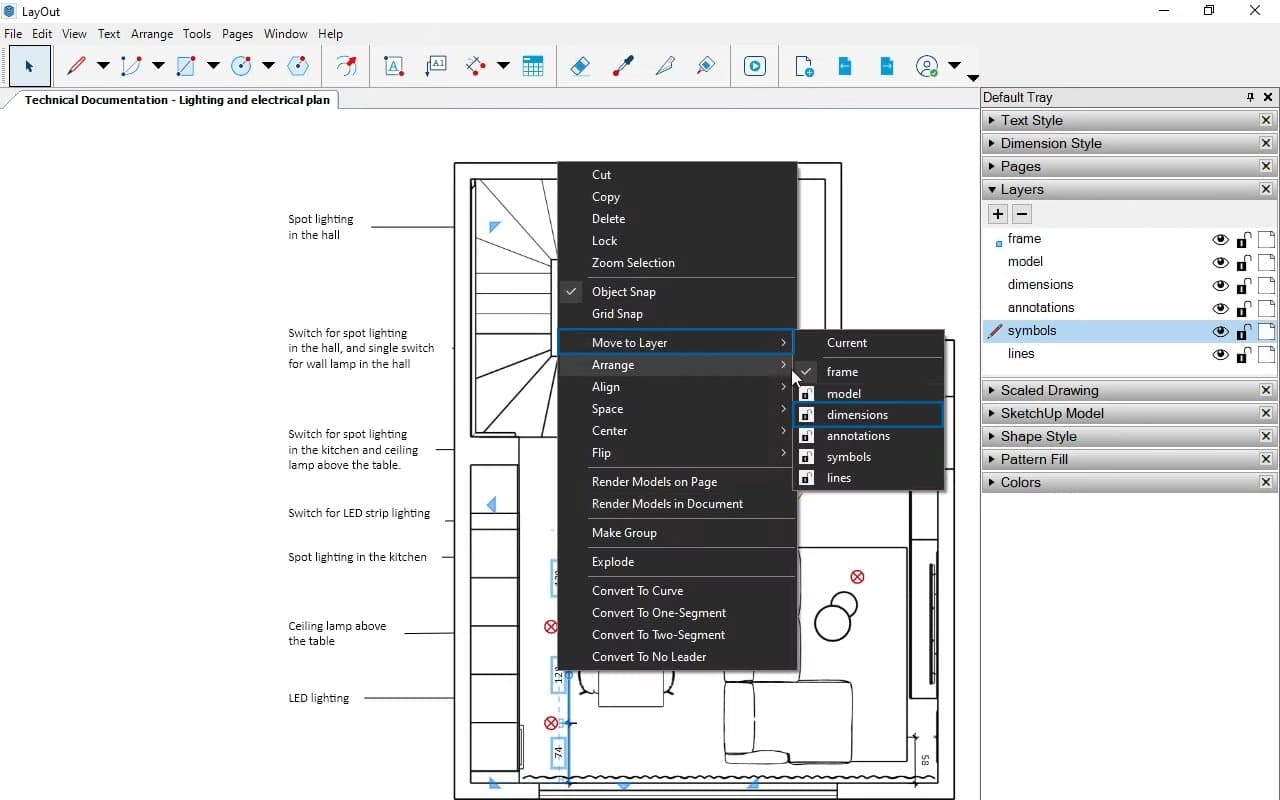
It’s essential to understand that the hierarchy of Layers in SketchUp Layout is extremely important. If the Model layer is on top, it can cover dimensions and annotations, making them invisible. To avoid this, I place the Model layer at the bottom and stack layers with annotations, symbols, dimensions, and other elements above it.
4. Separate Scene = Section Cut
To create accurate 2D views in SketchUp, it’s essential to use section planes effectively. However, working with section planes can sometimes lead to issues with views and sections. Here’s the golden rule: One section plane for one view.
Best Practices for Section Planes
- Avoid Moving Active Section Planes: Once you’ve created a section plane, avoid moving it. Moving an active section plane can cause problems with other scenes and disrupt your workflow. If you need to create a new view, simply create a new section plane.
- Managing Styles and Section Cuts: Another common problem with section planes is related to styles. Here’s how it works:
- If your view uses a style with the “Section Cuts” option checked, the section cut will be active.
- If you switch to a style where the “Section Cuts” option is unchecked, the section cut will not be active, potentially damaging your view.
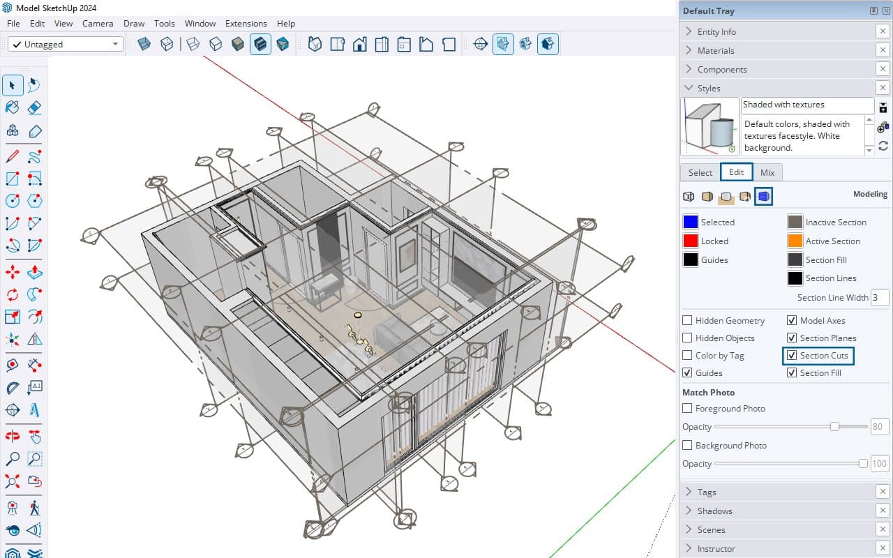
To avoid this, always control your styles carefully. For views created with a section plane, make sure to use a style where the section cuts option is checked.
Bonus Tip!
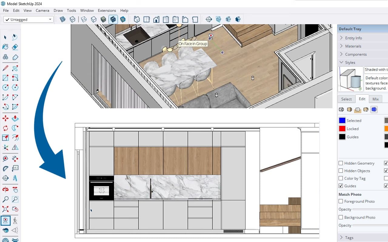
If you’re not a big fan of having dozens of section planes in your model, you can use the Position Camera option. Here’s how:
- Click on the “Position Camera” icon.
- Click somewhere on the floor and drag along the axis to get an elevation view.
- Change the camera to parallel projection to achieve a 2D view.
The only downside to this method is that you won’t get a section fill, as you do when you create a section plane. This technique keeps your model clean and reduces the number of section planes you need to manage.
5. 2D Drawings and Symbols
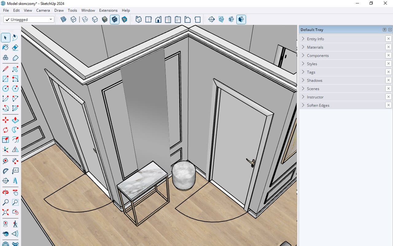
For greater accuracy and clarity, use 2D drawings in SketchUp. Create 2D representations for door swings, lighting, and furniture. To keep everything connected, group the 3D model with the 2D symbol. Assign these 2D drawings to a tag, which allows you to easily turn them on or off as needed.
In SketchUp Layout, I use symbols for lighting and installations. All symbols, dimensions, and fonts are prepared in two scales: 1:20 and 1:50. I keep these elements handy next to the drawing and use them as needed.
Additionally, with the style icon, you can copy properties like line styles and dimensions, including font size and type, to ensure consistency across your drawings. This makes your drawings clearer and more visually appealing.
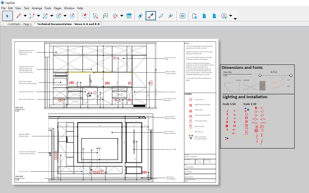
Use these tips to avoid common mistakes and achieve great 2D views every time. By optimizing your SketchUp Layout workflow and implementing these best practices, you’ll enhance your productivity and the quality of your documentation.
